
De Beers UK Appointment Booking
Clients
De Beers UKEmployer
Skywire StudiosRole in project
UX DesignerActivities and tools
Prototyping User research Adober Illustrator Balsamiq WordPressYear
2017Creating an online booking interface for in-person appointments
Customers shop online everywhere, but shopping for luxury products can be tricky when the actual product and customer service are not accessible. While there was a hotline for making in-store appointments, an online option was unavailable. We were commissioned to design and build this new feature for the client."
I was responsible for the UX Design, including the User Journey, User Flow, Wireframing and Prototyping, for the introduction of the new appointment booking service.
Design goals
- Create an online booking system as an alternative to the existing hotline.
- Allow users to view appointment availability more easily and accessibly.
- Promote the convenience of appointment booking to ultimately increase business opportunities.
Ideation
Since we didn’t need to build the web UI from scratch, we decided to explore the strengths and weaknesses of the existing hotline system to use as the foundation for the user flow.
By speaking with the customer service team, we gained a basic understanding of how users make appointments via the hotline, step by step. I even scheduled a real appointment to identify key milestones in the process. After a few more conversations with the client and some iterations, we created the following flow:
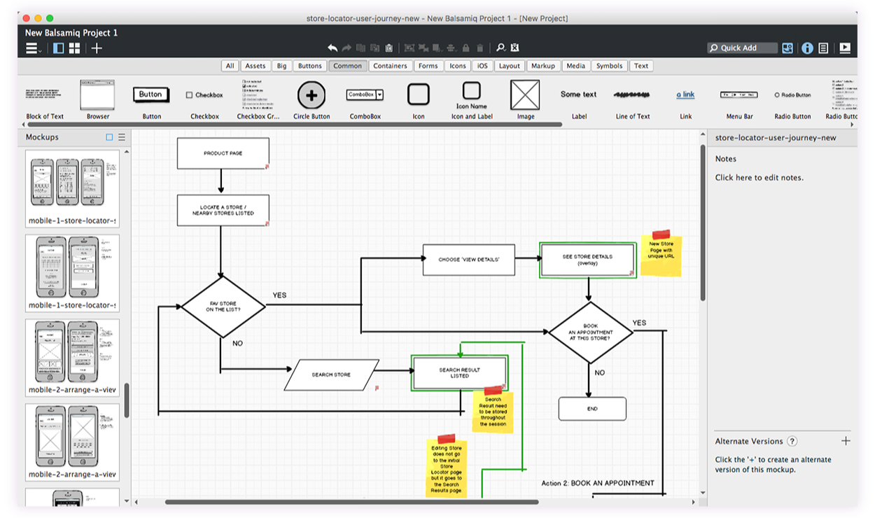
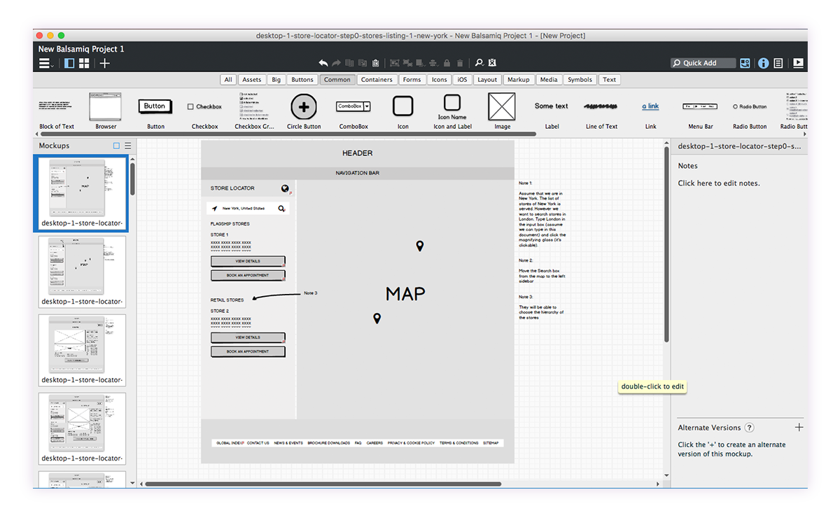
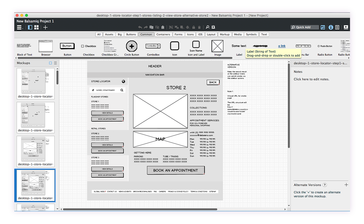
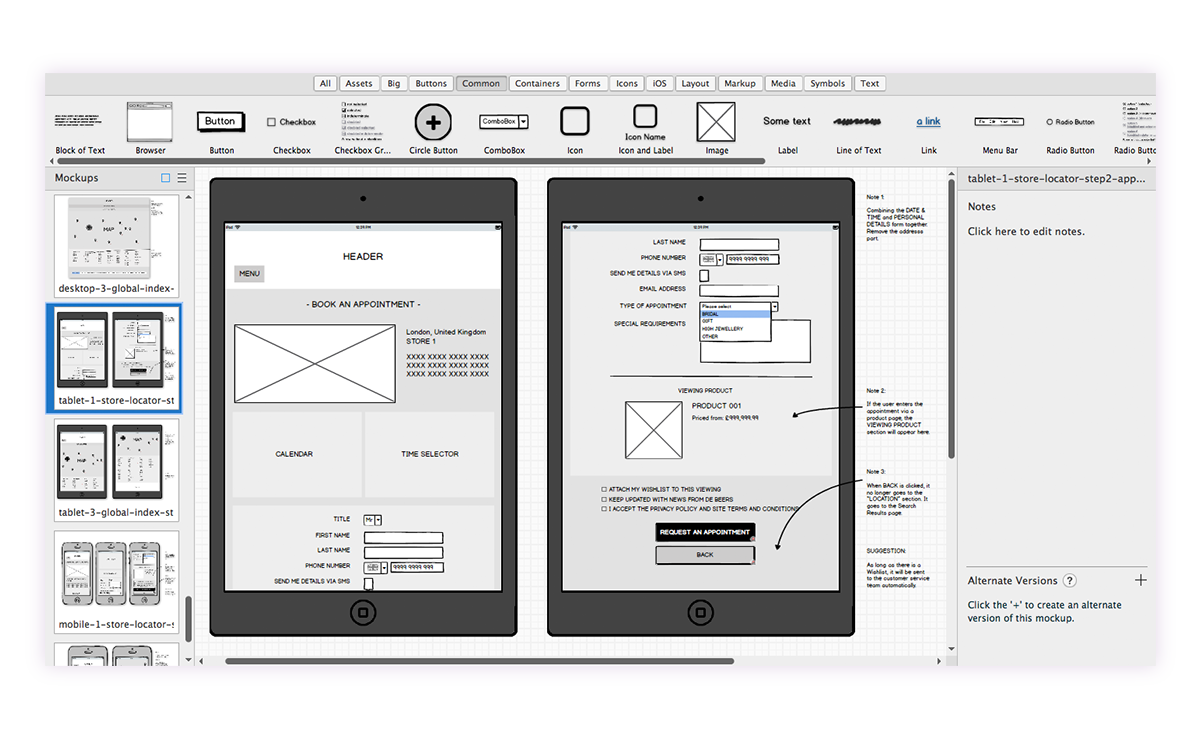
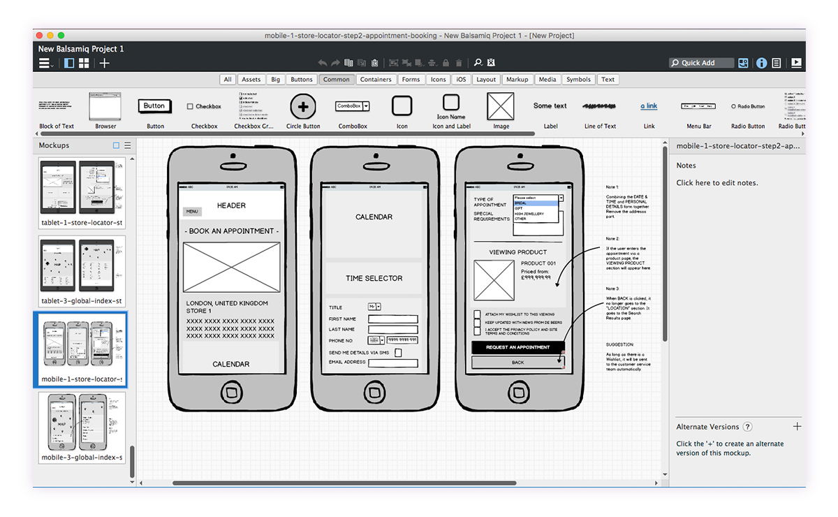
This gave us a clear direction for wireframing. We quickly created some sketches in Balsamiq for the desktop version:
Analytic data provided by the client showed that mobile users accounted for about 50% of the overall traffic to their product pages. As a result, we also sketched tablet and mobile versions to ensure a consistent user journey across all devices:
Prototyping and testing
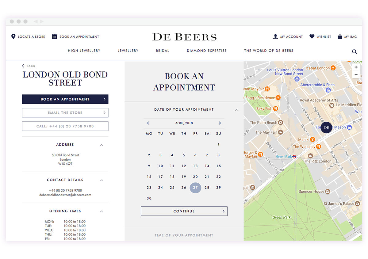
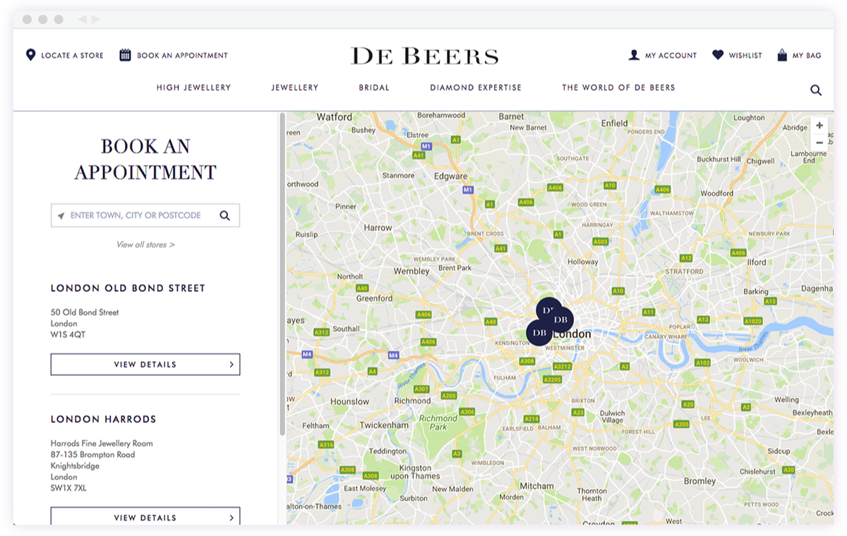
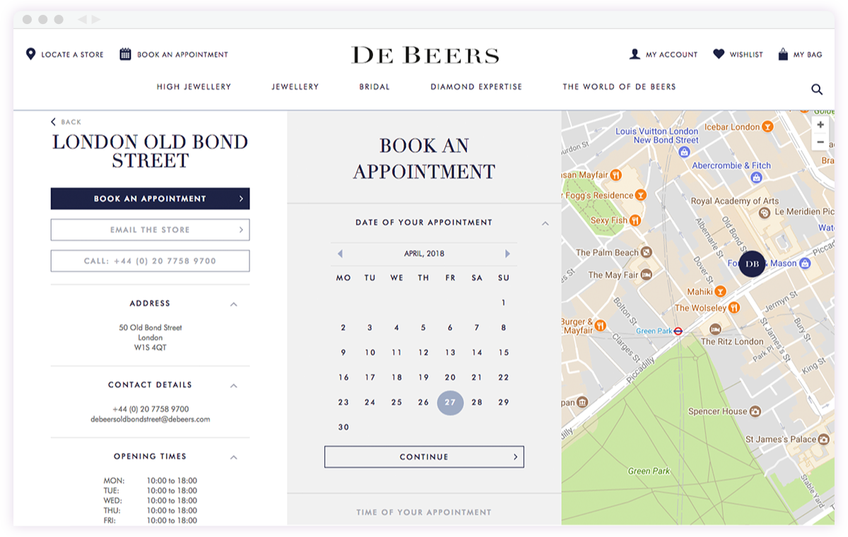
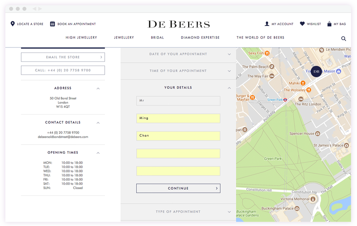
In this project, we focused more on the user flow than on visual design, as we were confident that once the flow was correct and user-friendly, the visual design would follow naturally. Since I’m also comfortable with front-end technologies, I created an HTML prototype as a research tool. The key pages included the map/list view of the stores, the appointment picker, and the form for filling in personal details:
User research
From the 9 participants we interviewed over 6 weeks, the journey we created was simple, clean, and straightforward. There were a few issues to address in the mobile version's map view, but overall the feedback was encouraging. We made some design iterations based on the feedback we collected at the end and that's it.
It's easy to navigate. I like the calendar view because I can't imagine getting all this information over the phone.
The steps are clear and straightforward. I don’t like the pressure of calling a salesperson to make an appointment when I haven’t decided to buy yet, so this online service definitely helped reduce my hesitation.
Outcome
We didn’t have the data to measure the success of the new feature, but the client reported that it greatly reduced the burden on the customer service team. We all concluded that the new feature benefited both the client and the customers overall.